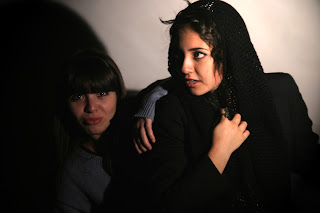
First photo (top left): I was using a tungsten light. I raised the light to the height of about 5 feet. The light was placed slightly behind her behind her. I'm not so sure what feeling this type of lighting gives. I would say this is my go to light set up because its simple and easy to set up.
Second photo (top middle): For this picture I believe I used two tungsten lights. I used one light to light the background and one to light her. I feel that this lighting gives a gloomier and colder mood. I also cropped this picture a bit.
Third photo (top right): This was a very simple set up. I was only using one tungsten light and I had it right in front of her... maybe a little to her right, based on the shadow created from her nose. The background was completely black, remember that my background was white. I feel this lighting is very beautiful and adds a sense of mystery and darkness.
Forth photo (bottom left): In this picture I didn't light Briana, instead I just lit the background. This is a pretty good set up if you only want the silhouette. However, I just noticed that because she was wearing a knit thing on her head it looks like she has a beard. I was using a tungsten light.
Fifth photo (bottom middle): Out of all 6 pictures I think this is one of my favorites. I was setting up the strobe and I hadn't plugged the cord into the camera yet. I noticed how soft and beautiful the light looked so I took a picture. Unfortunately, it came out green. I think that's one of things I like about it, though. But when I uploaded it to the computer the picture was completely black so I had to photoshop it. First I lightened it and then I did a bit of lighting effects just to make it look less flat. I like how this picture looks because it looks old timey, like a portrait taken a hundred years ago. I don't like that it looks so grainy and unfortunately, when I uploaded it to weebly it showed rings of light or something on the right side of the picture that weren't there when I was editing.
Sixth photo (bottom right): For this picture I was using the strobe light so it's really bright. I tried to pull it away from her so it wouldn't be so harsh but it was already as far as it could go. I feel that this set up would be more fitting if she was facing the camera and smiling, it's very bright and cheery. I like this set up because it makes her skin look so beautiful.


