Wednesday, October 12, 2011

Awkward Pictures: Diane Arbus


My picture of Darrian
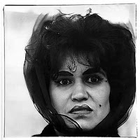
Original Diane Arbus photo


 For my attempt at Diane Arbus' style I used Darrian as my model. I actually had to reshoot my picture because the first time I tried they didn't quite work and I didn't really like them. I took Darrian outside and sat her on a bench. I was having difficulty with the lighting though. It was a pretty cloudy day and they kept moving in front of the sun and by the time I would get the camera adjusted it would be sunny again. This one of the shots where the clouds suddenly moved out of the way of the sun.

The photo is overexposed but I feel that it works better than my other pictures. The trees in the background are out of focus, which keeps the viewer focused on Darrian. I had her make the same face as the lady in Arbus' photo. However, it doesn't seem exactly like the expression of the lady in the other photo. I feel that if Darrian had lipstick on it would exaggerate the expression a bit more. Luckily, Darrian is naturally awkward so it doesn't look staged.

I hope you liked it :)


Friday, September 30, 2011

Sally Mann's Style


Sally Mann
Sally Mann


The top two images are of my little sister Sara. I was attempting to duplicate Sally Mann's style. Sally Mann's models alway seem to have something that sticks out about them that makes them look kind of different and weird. One of the things that sticks out about Sara is that she has vitiligo, which has turned some of her skin, as well as her hair, white. I had her part her hair differently than she usually does so we could see it. My sister was actually being kind of difficult with me so I'm lucky I even got the shots.

I placed her against a black background and used tungsten lighting. I had her stand up and open her eyes wide. After the shoot I put the photos in photoshop and changed it to grayscale and duotone with black and a copper type color. I added a duplicate layer and did a gaussian blur and erased it where I wanted it in focus.

What I like about these two photos is that they seem to have a deeper emotional feel to it. I can't quite figure out why that is though.

I hope you enjoyed it :3 


New School Year 2011

Tuesday, July 12, 2011

SUMMER INTENSIVE 2011

Unfortunately I got really sick during the summer intensive so I was not able to take many pictures :(


Wednesday, June 8, 2011

Street Photography with Adam


This is probably one of my favorite pictures from that day. I acheived this shot by putting my camera on Adam's dashboard while he was driving and put it on a really slow shutter speed. One of my favorite things about this picture is that you can still see the buildings and they look so far away.


Thanks again Adam! :D

Final


I took the above photo on May 21, 2011. At first glance this pretty little girl seems completely normal besides the fact that she's in a wheel chair. But infact this little girl is sick. She has cancer. I was at the Celebration of Champions when I took this. The Celebration of Champions have been going on for 16 years. It celebrates all the children who are going through cancer, beat cancer, or sadly lost the battle to cancer.

My family goes every year since my brother had cancer. We've been going at least 5 years (I think). The reason why I decided to use this picture for one of my final photos because it is a picture I felt that actually had meaning. When you think of cancer you don't really think of a child who looks this happy or well. I really like this picture because of that fact. Even though she's sick she's still smiling and happy and I think that's what I like most.


This is my second picture for my final. There really isn't a deep meaning to this one. I took this one on May 30, 2011. I was kind of freaking out because I didn't know what to do for my final so I called up my friend Adam Ghahate, who is a photo stutdent in college, and he took me to Down Town and Seaport Village. The kind of photography Adam does is street photography, which I had never done. It  is incredibly fun. I was having a blast running around everywhere and taking pictures.

The reason why I decide to use the photo above for my final is because I don't really take pictures of the ocean or buildings. I felt that for my first time this picture is really good. I will also be posting other pictures I took on our adventure.

I hope you enjoyed them :)
Bye :3

Wednesday, May 4, 2011

Rough Draft of Prop H8 Brochure

Below is the rough draft of my "Prop H8" brochure. Keep in mind that it is divided into 6 panels, 3 on top and 3 on bottom. This took quite awhile to do and it's not that great. It is pretty simple and I still need to add my business card (as soon as I finish it). Designing is just not my niche...


Monday, April 11, 2011

5 Photo Series

Probably for the rest of the year I'm going to be doing photo series of fives. I finally thought of a good idea that I actually care about, childhood cancer. When my brother was twelve years old he was diagnosed with two brain tumors, which we later found out were cancerous. My brother was in the hospital for months, although it felt like a year. I remember that he looked the same before and immediately after his surgery but a few weeks later when my mom took me to visit him I thought we went into the wrong room. How could the puffed up boy on steroids be my skin and bones brother? I was about to ask my mom "Where's Miguel? Are you sure we have the right room?" when he had greeted me by shouting "Hey Tina!" I never knew someone could physically change so fast, it amazed me.

Every month me and my brother go to a cancer support group meeting for teens with cancer and their siblings. I have friends who have cancer and friends who's brother or sister has cancer. I've suffered losing quite a few of them to this horrible illness. Everyday I'm thankful that my brother has survived and has been cancer free for almost 7 years.

My idea is to obtain a picture of a cancer patient before they were diagnosed with cancer and capture a photo of when they are fighting the cancer.

The images below of my brother helped inspire this idea

Miguel at age 12

Miguel and my dad at Celebration of Champions
Miguel was going through cancer treatment (if you look closely you can see that he was bald)

Me and Miguel years later at Celebration of Champions
By this point Miguel had beaten his cancer

My brother, Miguel, age 18

Glowing Lights

I took the following photos at my friend Cindy's house when I spent the night. They were created by taking glow sticks and doing various things with them while shooting at a very low shutter speed. I then went into to photoshop, copied the color, and pasted it to a black background. I also changed the brightness and contrast. I hope you enjoy them :)


Friday, March 18, 2011

Rough Draft of Artist Statement

*The following has been edited to protect myself from creepers

Christina Cervantes
b. 1995
"Some City", "Some State"

Biography
Christina Cervantes found her true passion at the age of 14 when she attended a summer intensive for photography in the summer of 2009. Since then she has studied photography at "Name Of My School" for 2 years. Her work has been featured in the Summer Intensive Show (2010), the "AOMS" (abbreviation of my school) brochure (2010), and in the Grand Theater multiple years. She has only done one solo exhibition titled "Prop H8". She hopes to be a professional photographer when she grows up.

Artist's Statement
My exhibition "Prop H8" deals with the stress and emotional distress of being part of the LGBT community. It is an attempt at opening people's eyes and minds. Most of my work takes the still young faces and bodies of teenagers, who are not straight, and puts them in edgy, shocking, and emotionally painful scenes, settings, and scenarios. Occasionally my work will feature adults, young children, straight people, and cheerful scenes.

My personal objective is to not sugar coat what's going on but instead expose some of the suffering and thoughts of the gay community. I have no interest in creating "pretty pictures". My photos show the pain of hiding who you are, hiding your love, bullying, and suicide. I show victims of hate and prejudice hoping that my viewers will understand my message.

My work is influenced by the gay community, the news, and my friends. When I hear or see an issue that pertains to being gay it inspires me and it makes me wish I was invisible so I could take a picture and it'd be raw. I like to try to make the viewer feel like they're right there in that scene.

Most of my work is in color. The purpose of that is so it will be easier for the viewer to put themselves in that scene. Something I like to do with my photos is bring you close up to what's happening or stand at a distance that someone might stand at. By doing this you focus on the subject. I want the viewer to be right there. I want them to be stuck in that specific moment in time.

Monday, March 14, 2011

My Weebly

I wasn't exactly sure where on my blog to put this so I'm putting it here :D

My portfolio
|
|
|
V


Check it out and enjoy :3

Friday, March 11, 2011

Japan's Earthquake Causes Tsunami, Fires, and Landslides


To view the entire story please click here

I don't know any prayers but if anyone viewing this does, please, pray for my grandmother's family, the Fuda family, and my dear friend Jin and his family as well as everyone else effected by this horrible disaster.

The earthquake was at 8.9! One of the worst to ever hit Japan. Later, a tsunami with waves 30 feet high hit. I don't know what else to say.... I'm not a very religious person but even I will be praying for them tonight.

Thursday, February 3, 2011

Business Cards


So this is my first business card. I've blocked out my cell so scary/creepy people can't call me and I blocked out my email because I dislike spam. I only have this one to post for now but more are on the way :3

The font I used is called Sketch Rockwell. I decided to used that font for this one because my logo (which is a muffin) is kind of rough and isn't perfect. I made my logo last year in Art 1-2 when we were starting linoleum prints. I had kept a few of my first practice prints and this is one of them. All I needed to do was scan it into my computer and do some photoshop and poof I have a logo. I'm actually considering printing this card on cardboard because it's more interesting and more durable. 

Friday, January 28, 2011

Second Semester

On Wednesday Ms. Miles met with the juniors and sophomore and told us that for the second half of the year she wants us to think of 10 new ideas that we might like to try or do for a senior ex. Yesterday we went to Balboa Park and saw the Museum of Photographic Arts (MOPA). The show we saw there was called "New Realities: Jerry Uelsmann + Maggie Taylor." I got a lot of ideas and inspiration there. So here is my list of things I would like to do or try:

  1. Dark room trickery as done by Jerry Uelsman
  2. Black and white photography
  3. The innocence of children
  4. The happiest moments of our day
  5. Portraits that look like they were shot in the 60's-80's (may go with #2)
  6. My family
  7. Cancer
  8. Abandoned buildings 
  9. Genetic disorders
  10. From child to teenager to adult
  11. Teen angst
  12. Gay rights
  13. Fantasy (such as Maggie Taylor)
  14. Abuse
Okay so I thought of more than just 10 but I guess that's kinda good. This list isn't really in order but the top 9 I'd really like to do but as for the  rest I'm not so sure about but I'll try them.

Thursday, January 20, 2011

#8 The Pledge of Allegiance

Pledge of Allegiance

The photo above was taken Wednesday, January 12, 2011. My model was my dearest little sister Sara. In this picture she is holding a paper with the words of the Pledge of Allegiance printed on it but after the part where it says "with liberty and justice for all" there is a red * and under that sentence is the sentence "*unless you're gay."

The reason why I decided to use my 10 year old sister instead of one of my classmates is because it represents that if parents, adults and other people say that something is bad or wrong that children do listen and are influenced by our words and actions. The reason I put "*unless you're gay" at the end is because many people feel that because the LGBT community doesn't have the same rights as a straight person that our nation is not as free and just as we say it is. I originally wanted to shoot in the Grand Theatre but I felt that the background of the school may make the photo more interesting and there would be more natural colors. For the editing I simply changed the contrast and used a tutorial to learn how to darken the edges of the picture.


This is usually the point in my blog that I would rant about how unfair and unjust society is but I really don't know what to say that I haven't said before. I often wonder how many people have to say one thing and how many times they have to say it for something to change. To be honest sometimes I can get so disappointed in my country. Don't get me wrong, I love living here, I love what I have and I'm thankful for it. But if you say "liberty and justice for all" and "We hold these truths to be self-evident, that all men are created equal, that they are endowed by their Creator with certain unalienable rights, that among these are life, liberty and the pursuit of happiness." people will hold you to that and will be extremely angry when their unalienable rights are violated. I know people will say that life isn't fair but when it says clear as day in black and white that this is how it is then that's how it should be! No excuses!


I hope you enjoy the picture
Till next time


Links:
The Declaration of Independence